



Tables are great! Like a data visualization, they allow readers to view data in an intuitive format, highlighting the information that is truly important. (Note: refer to tables book) Plenty of data scientists now use LLMs to help them write code and produce tables and though Great Tables provides everything needed to produce phenomenal tables. However, getting an LLM to use the Great Tables API well can be a struggle. To bridge this gap, we developed a Great Tables skill. Internally, the skill explains to an LLM the structure of a good table and how to effectively use the features provided by Great Tables. The end result should be higher quality tables than you might get without the skill.
Why do we need a skill?#
When building a table, there is a lot to consider. Changes as simple as the ordering of columns can greatly affect the way a reader interprets and thinks about the table. Without any guidance, LLMs are not able to capture the scope of this problem in its entirety. You are likely to get table outputs that don’t structure for clarity, and you might find that values haven’t been formatted.
Here are two LLM-generated tables, one built without using the skill and one with the skill. Both are built with the same prompt:
Build a table showing the top 10 most expensive cars, grouped by country of origin, including their drivetrain and transmission details.
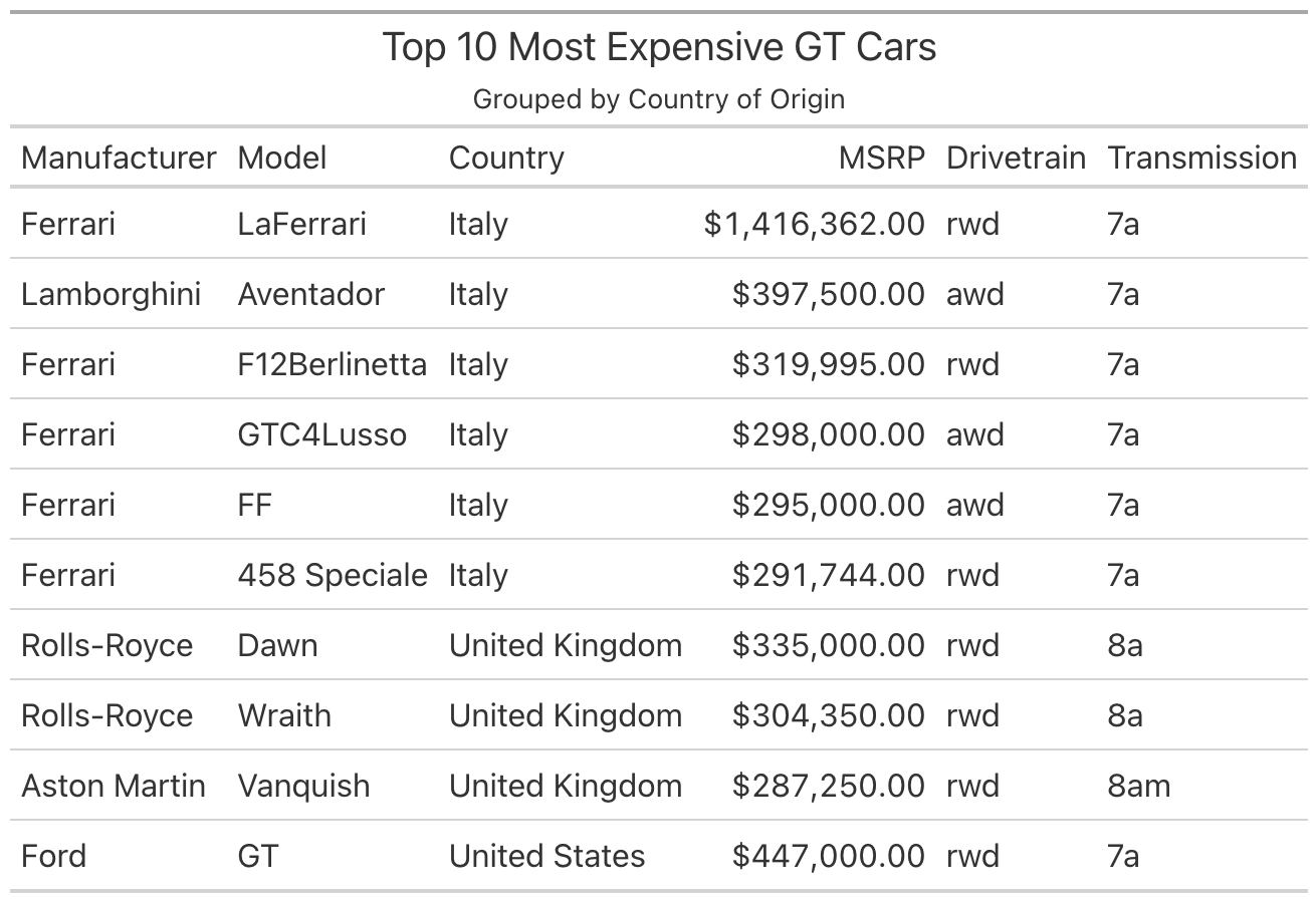
Taking a look at this table, it’s not clear what we want to focus on or what is valuable information. The rows are ordered correctly, but the country groupings are in the middle. Similarly, though we do have the most expensive cars hierarchically organized, it’s not clear
Instead everything is just simply shown and it is up to the reader to think about what the data means and derive a conclusion.
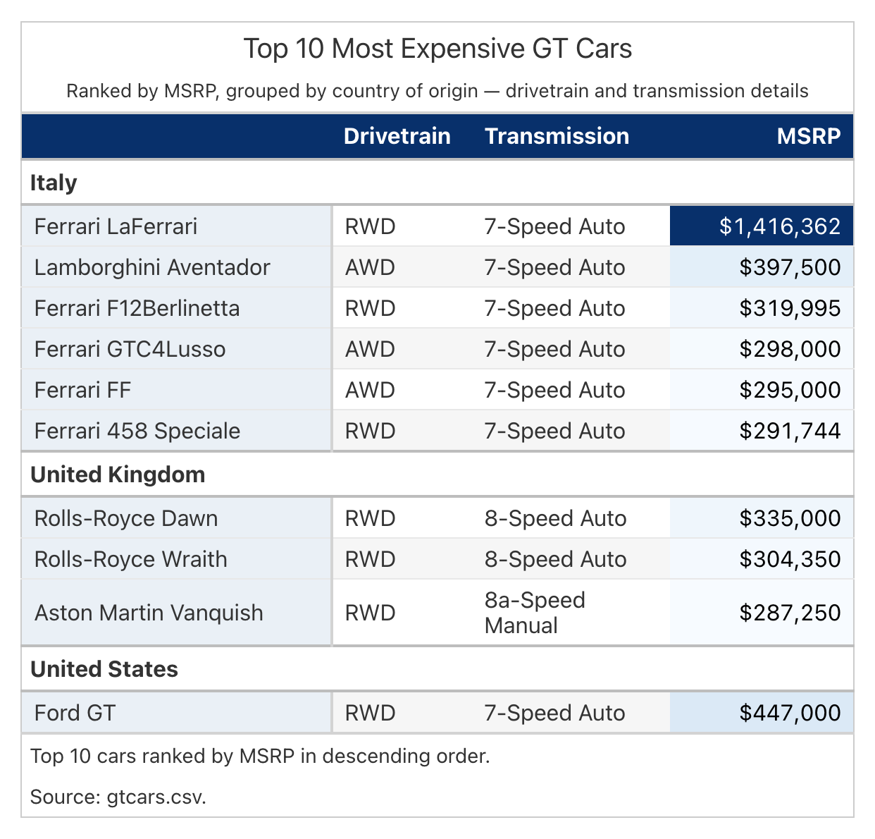
Note: Talk about what things the good table does better than the bad one. Shows the grouping, better visual aesthetics, draws focus to msrp to draw attention via heatmapping.
Now considering this, it’s obvious to focus on the heatmapped column and the distinction of groups. The table naturally guides the reader into gaining meaningful information about the data.
This is the fundamental purpose of the skill. It allows data scientists to not change anything about their prompt and get a higher quality table from their LLM.
How does the skill work#
At a high level, the skill is a flowchart of guidance. It simply provides the LLM with answers to choices like “How should I format this column?” or “What columns should be spanned together?” so that the LLM can simply follow guidelines and produce results similar to what a data scientist would need to showcase their data. By use of this framework, the LLM gets our codified understanding of what makes a good table.
How we evaluate the skill#
To begin, we built a corpus of realistic user tasks that includes a dataset and a request that a user might give to an LLM. For each scenario, we created a hand-crafted table to serve as an ideal response to the request.
To then test this, we sandboxed an LLM agent, provided it with a prompt and evaluated its performance compared to a baseline (without using the skill) and our hand-crafted table. We then repeated this process on various prompts and measured the consistency of the agent’s output using the skill. For more information about this, check out the testing harness and our methodology gt-skill.
The Numbers#
To evaluate the overall performance of the skill, the LLM agent was evaluated against the entire corpus of prompts and benchmarked on its closeness to our hand-crafted table. To measure that the skill was producing high-quality tables consistently, we repeatedly tested the agent against each of these prompts over several runs.
The plot below shows the evaluation scores (with and without the skill) of our runs on a selection of prompts from the corpus. Higher scores reflect how closely the agent’s rendered table matches our hand-crafted table.
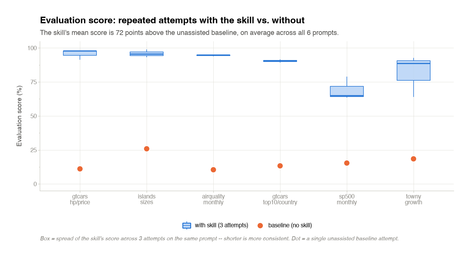
Considering the results of these evaluations, there is a noticeable increase in performance accuracy when using the skill. On average, the skill improves by [NUMBER] percentage points above the no-skill baseline. This quality improvement was shown to occur in tests over the entire corpus of prompts. You can view our complete testing results here. [LINK]
To truly understand the improvement made by the skill we must also factor in the cost and token consumption of the skill. The following plot shows the cost difference with and without the skill.
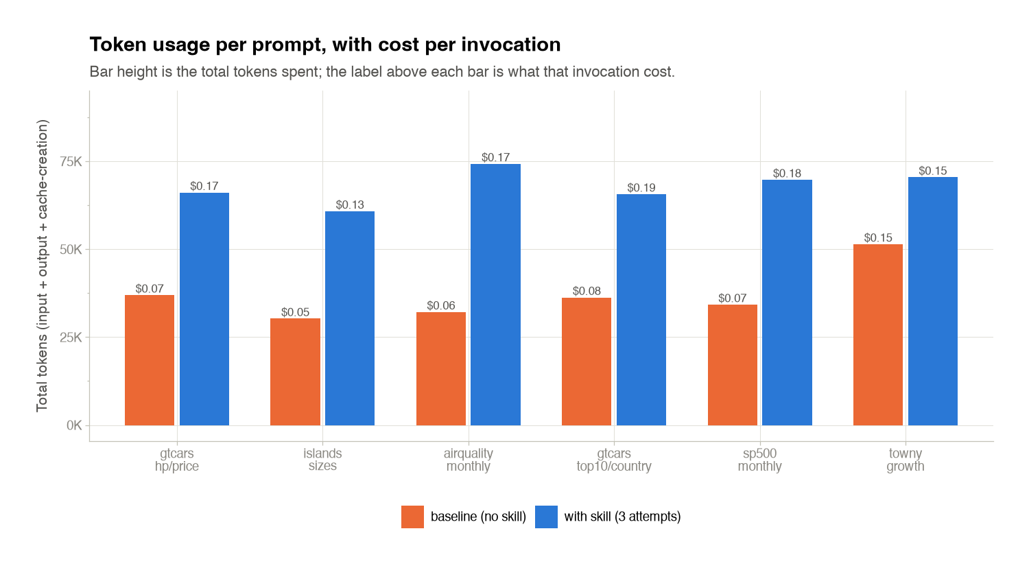
Naturally, the added specification and guidance provided by the skill gives the model more to read and think about, therefore causing the costs to increase. Across all of our scenarios tested, the increase in token consumption is roughly doubled when using the skill. But in real terms, the cost increase is only $0.05–$0.10 for a basic frontier model (in this case Claude Haiku 4.5).
Why use the skill#
For a few extra cents per table, you get output that is measurably closer to what a data scientist would hand-craft, and you get it consistently across runs. That means less time spent re-prompting the LLM to fix column ordering, formatting, or emphasis, and more time spent on the analysis itself. If you already lean on an LLM to write Great Tables code, the skill is a low-friction way to raise the floor on what it produces. It is worth it when the table is something you plan to share, publish, or make a decision from.
How to install and use the skill#
The Great Tables skill ships with great_tables starting in version 0.24.0, so a normal install gives you everything you need. For install and setup instructions, see the Great Tables skills docs.